Creative Confessions: Five minutes with Jo leGleud and Marisa Gutmacher
Maddux Creative co-founder Jo leGleud and Vice President of Design for Samuel & Sons, Marisa Gutmacher, discuss their new passementerie collection, 'Gloriette'.
Samuel & Sons Passementerie is world-renowned for producing the finest quality trimmings, tassels, borders and braids. Established in the 1940s, Samuel & Sons began as a linen shop in New York City's garment district. In the following years the company evolved to focus solely on trimmings and interior design, and before long, customers were flocking from far and wide including names you may recognise, such as Andy Warhol and Salvador Dali. Samuel & Sons now have boutiques and showrooms across America, London and in Paris.
Marisa Gutmacher joined Samuel and Sons in 2010 as Vice President of Design for Samuel & Sons and is recognised as one of the industry’s foremost trimmings designers. Her extraordinary ability to successfully translate traditional aesthetics, materials and constructions into a contemporary context is widely renowned.

Prior to Samuel & Sons, Marisa was involved in developing product for a French trimmings mill during which time she collaborated on collections with luminaries such Kelly Wersterler, Barbara Barry, Michael Smith and brands such as Schumacher, Clarence House and Lee Jofa.
Among her many distinguished collections for Samuel & Sons over the past decade, she designed the Optix Collection, which won the Textiles + Fabrics Innovation category in the 12th Annual Hospitality Design (HD) Awards for 2016. Her patterns were also selected by Interior Design as Best Of Year 2017 and 2018 finalists. In addition, her trimmings have been featured in Architectural Digest, Elle Decor, Interior Design, House & Garden and World of Interiors.
Marisa has collaborated with leading designers such as Timothy Corrigan, Roger Thomas, and Lori Weitzner and her renderings have been exhibited at the Design Centre Chelsea Harbour, London, UK.
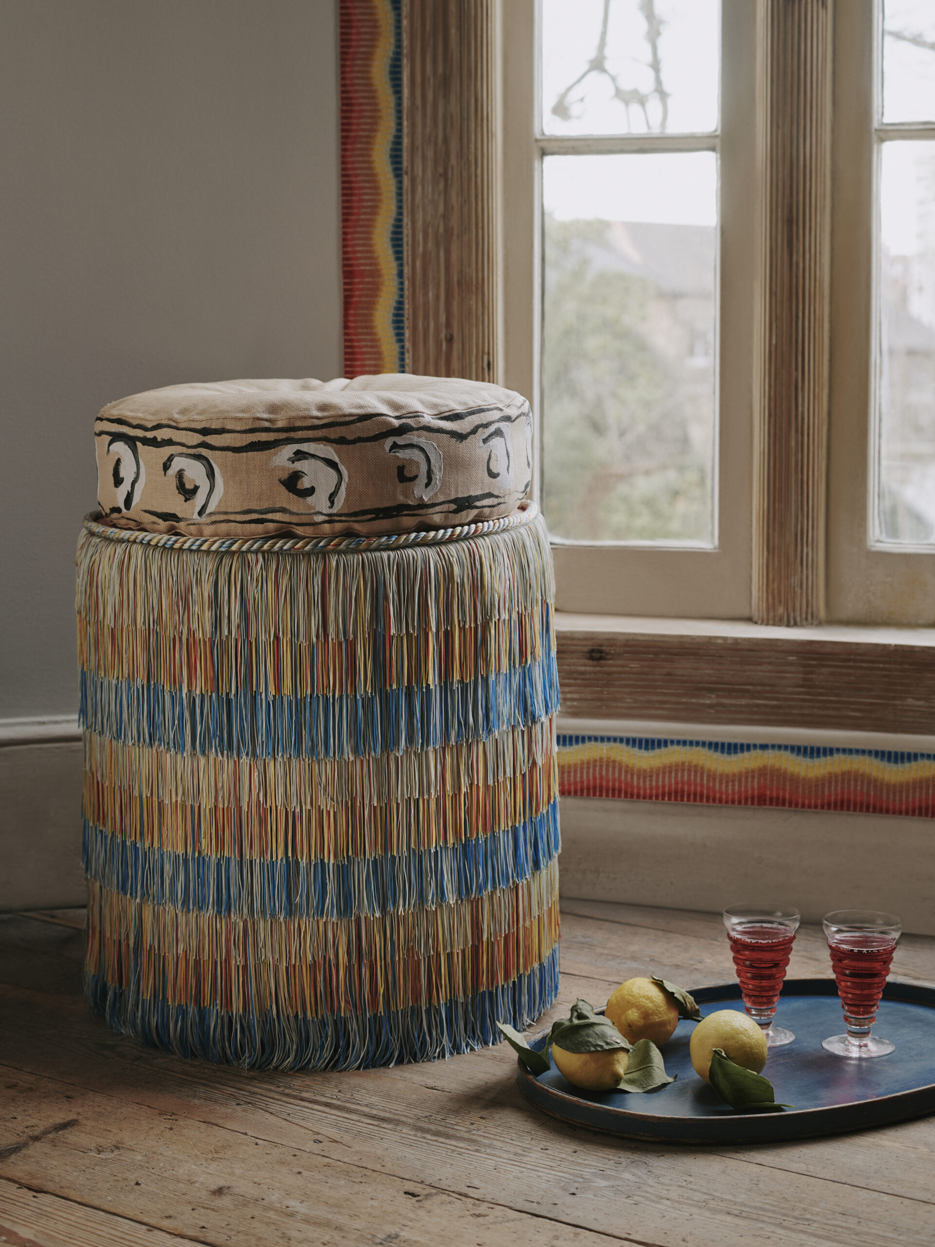
'Gloriette' is Samuel & Sons' latest passementerie collection, a collaboration with Maddux Creative. The collection is made up of three series' and celebrates the simple geometric forms of Neo-classical architecture, whilst honouring the detailed, joyous forms of Florentine Pietra Dura mosaic work with its vivid colour sensibility. The third series in the collection, 'Elementi', is inspired by the gradation of seasonal palettes and designed to reflect natural seasonal transience.
Jo and Marisa sat down to discuss the collection.
JO LEGLEUD Why did you want to collaborate with Maddux Creative?
MARISA GUTMACHER Samuel & Sons believes that exceptional design inspires, elevates and enhances the quality of people’s lives. We provide designers with endless creative possibilities, leading the world of passementerie with a visionary approach to classical trimmings in the 21st century. We collaborate with industry luminaries who bring a unique perspective to the art form within which we create. We sought to collaborate with Maddux Creative because of the lens with which they synthesize art, travel, architecture, fashion, history and craft into their interiors, which challenge convention, spark inspiration and a colour sensibility that delights the senses.
“Collaborating with Jo and Scott has been a marvelous creative journey in which we explored the language of neoclassical architecture and nuances of material combinations within the context of passementerie”. – Marisa Gutmacher, VP of Design, Samuel & Sons
Why did you want to collaborate with Samuel & Sons?
JLG Samuel and sons create passementerie that we have used across many projects, they seem to always have the right solution, contemporary but with a respect to the craft. I have enjoyed their custom and semi custom capabilities and became friends with Marisa, and a conversation grew from there.
What does 'passementerie' mean?
MG Passementerie refers to trimmings and is the art of making elaborate trimmings or edgings (in French, passements) of applied braid, gold or silver cord, embroidery, coloured silk, or beads for clothing or furnishings. Styles of passementerie include the tassel, fringes (applied, as opposed to integral), ornamental cords, galloons, pompons, rosettes, and gimps, as well as other forms. Tassels, pompons, and rosettes are point ornaments, and the others are linear ornaments.
JLG What kind of look does it create?
MG As with the variety of aesthetics that can be achieved with use of different textiles, applications and colour stories, trimmings can contribute to classical, transitional, eclectic and modern interiors. From festoons of traditional ornate hand tied silk tassels down a curtain panel, to a single contemporary graphic border edging the bottom of a sofa skirt or a micro woven cord delineating the silhouette of an upholstered chair -- tonal or multi, textural or highly refined, subtle or bold -- trimmings have continued to evolve over time. Today, there are endless choices in pattern, fiber, style, and colour to consider.
JLG Why might you want to use passementerie?
MG Similar to other home furnishings that are part of a designer’s language of ornamentation, trimmings are a means to communicate a designer’s vision. Its purpose is more ornamental and less functional, with the exception of curtain tiebacks or gimps to cover upholstery seams/tacks. Sophistication is achieved through attention to the finest details. Be it on a curtain, pillow, lampshade or upholstery furniture, Trimmings have the ability to introduce a new pattern, texture or colour into a scheme. It can create a focal point in the room due to its pattern or colour as well as change the edge condition of the piece on which it’s applied.
JLG How does passementerie work in more contemporary interiors?
MG Using traditional passementerie in contemporary interiors is all about attention to detail and curating a story based on pairing very specific elements to create the unexpected.
JLG What do you need to take into consideration when creating a collection like this?
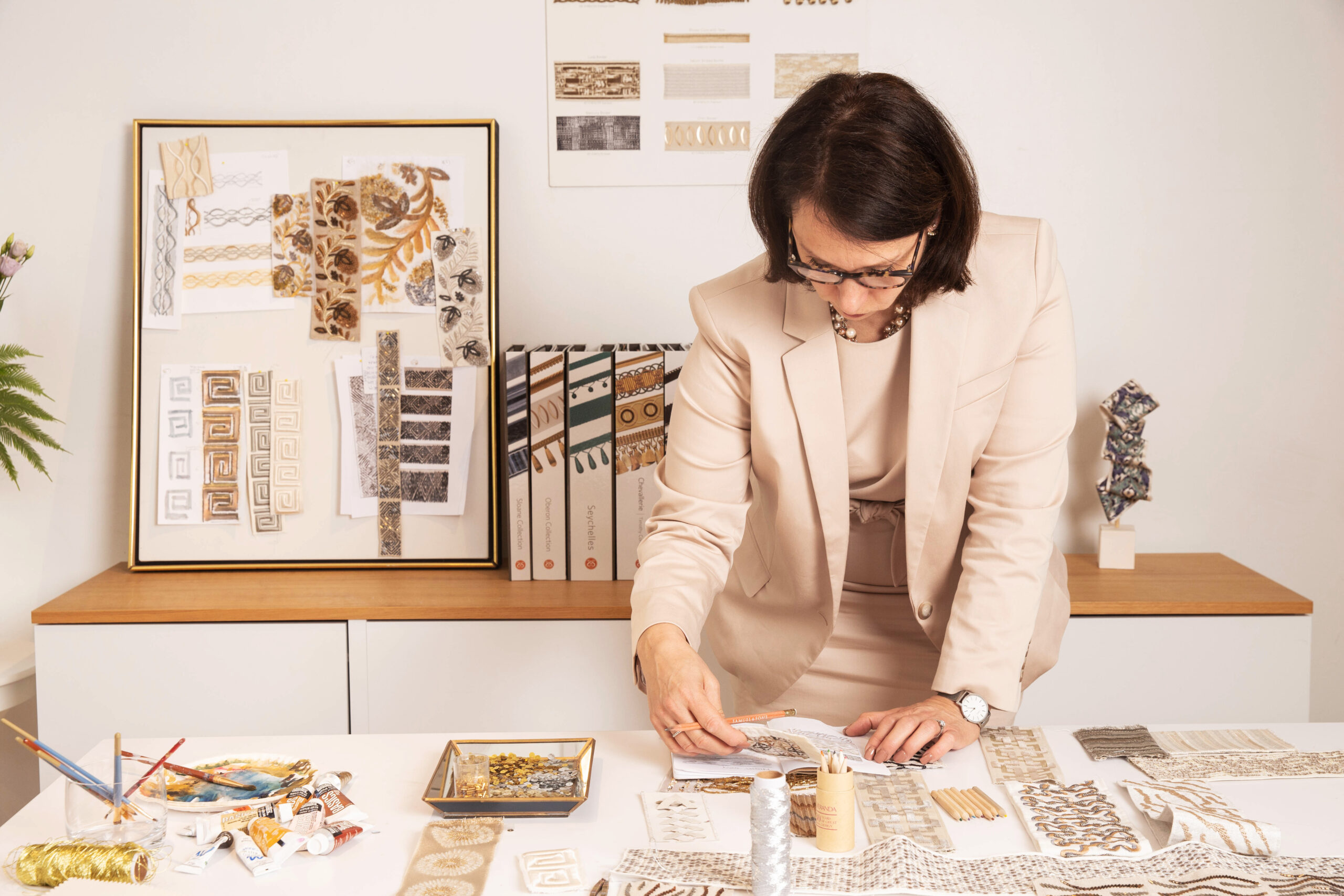
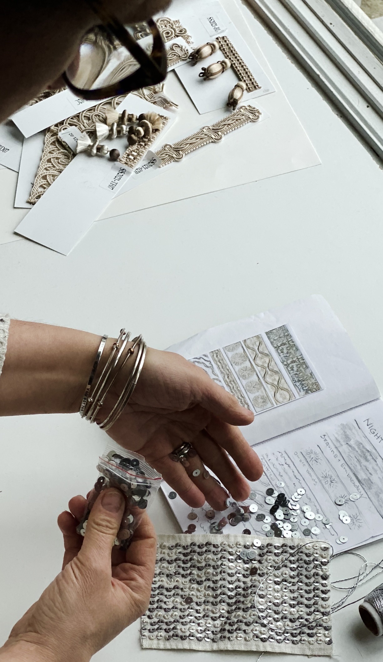
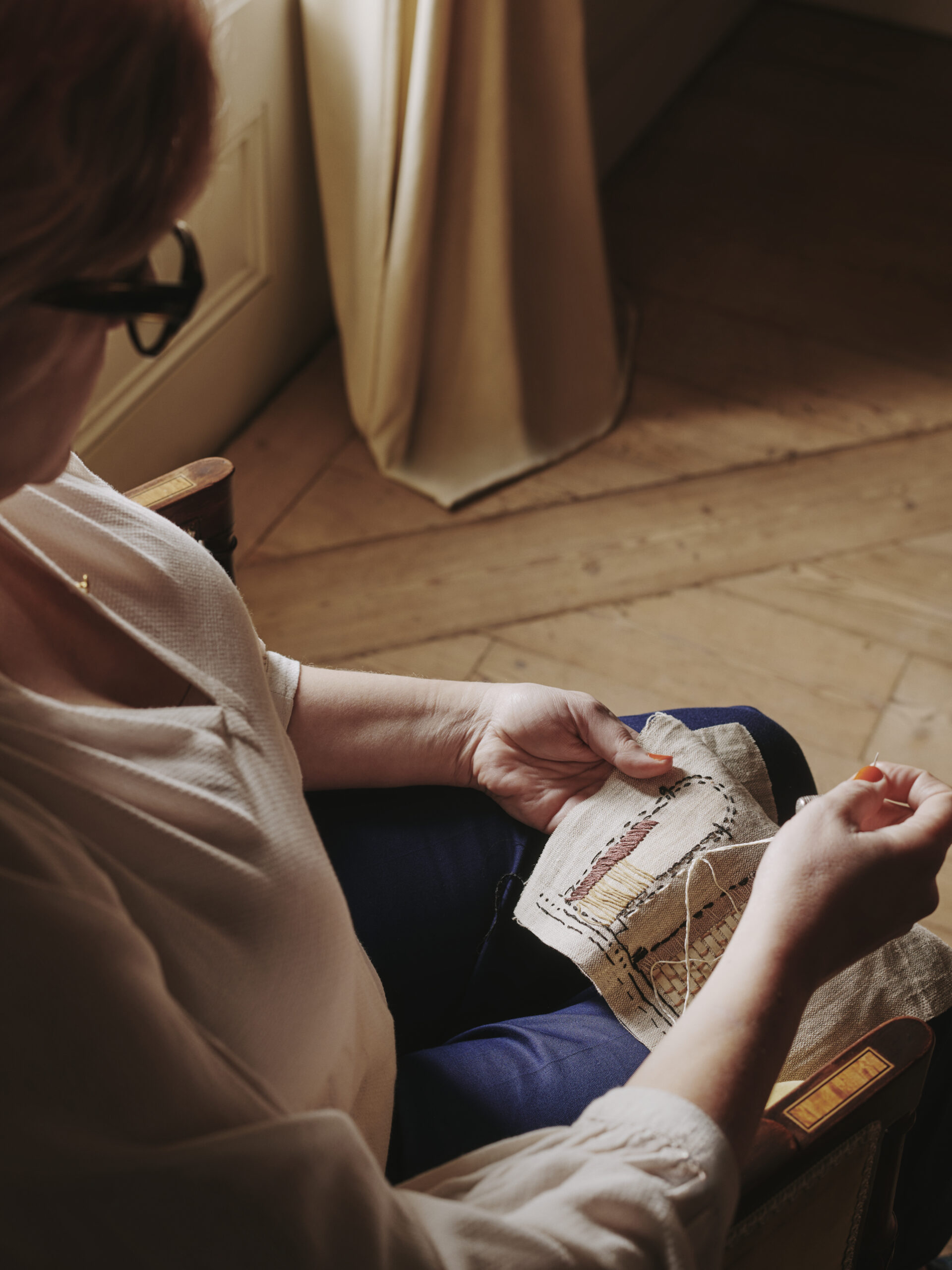
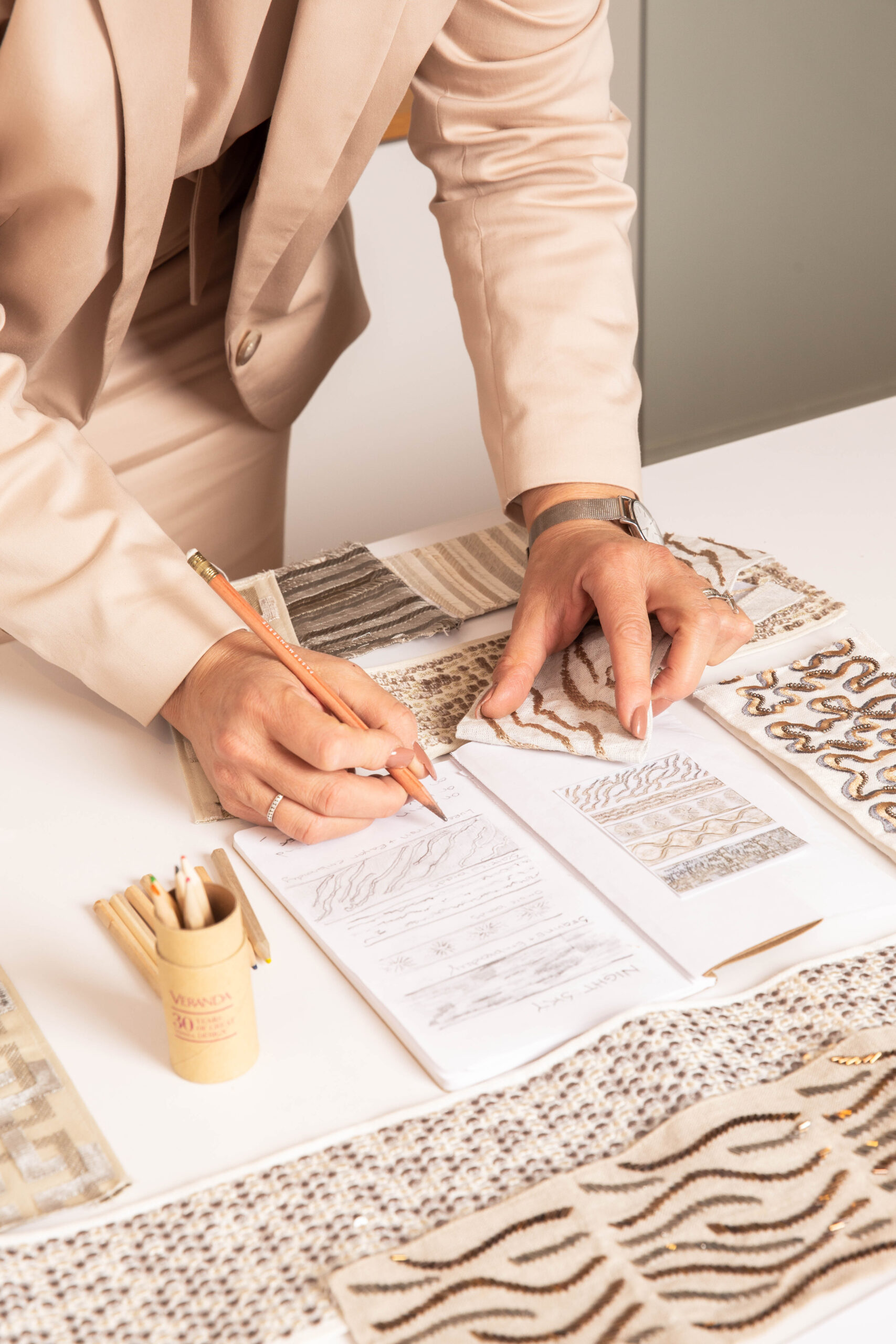
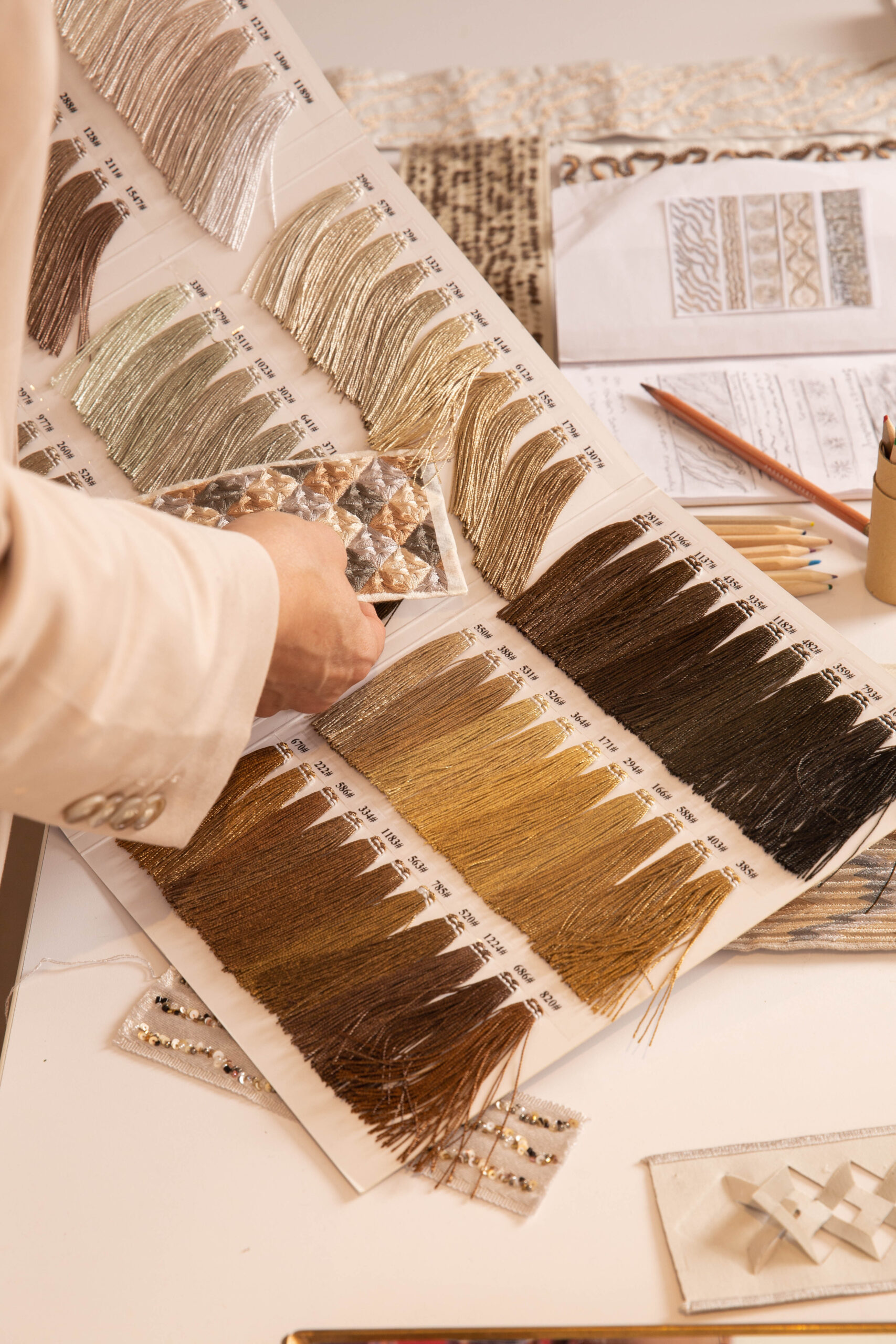
MG The design process is never linear; it starts with a concept based on form, function and materiality. The source of inspiration for trimmings can begin with a particular fiber or construction, pattern, historical reference, or something in apparel, art, nature, architecture, a lifestyle or a trend. Where I begin evolves into something else through adjustments to pattern, construction, scale and colour placement. Collaborating with remarkable weavers and craftsmen around the globe, and with a deep understanding of the language of classical Passementerie, I’m constantly transforming what “was” into what’s relevant for the 21st century.
MG Talk us through the inspiration behind the collection.
JLG We (Scott and I) had always been interested in the idea of creating passementerie that could be like (replace) an architectural detail. It feels quite unexpected but also makes something versatile. I looked at neoclassical architecture, the acanthus, columns, arches etc., and took time to consider various ways of recreating them in passementerie. The palette of neutrals for this part of the collection seemed correct but I wanted to add more colour, so looking at Palladio as he created some beautiful follies (‘gloriette’ in italian) in the grounds of some of his projects, with frescoes and mosaics in beautiful colours, reflecting the seasons or landscapes. Richly coloured oil paintings, provides the starting point for the 4 colourways for the elementi groups, the designs of which were based on watercolours and collages I created in my studio.
MG What kind of look does the collection create?
JLG I love how the arches, dots and columns of the ‘Archi, Colonna and Punto’ series, with the painterly trompe l’oiel detailing, draw the viewer in to further understand what they are seeing. The lush chainette fringe of the ‘Elementi’ series is just so vibrant, glamorous and tactile.
MG Obviously you like all of the designs, but is there one that’s a particular favourite?
JLG I LOVE the ‘Foglia Cablate’... it’s subtle but detailed, and the colours are gorgeous. What about you?
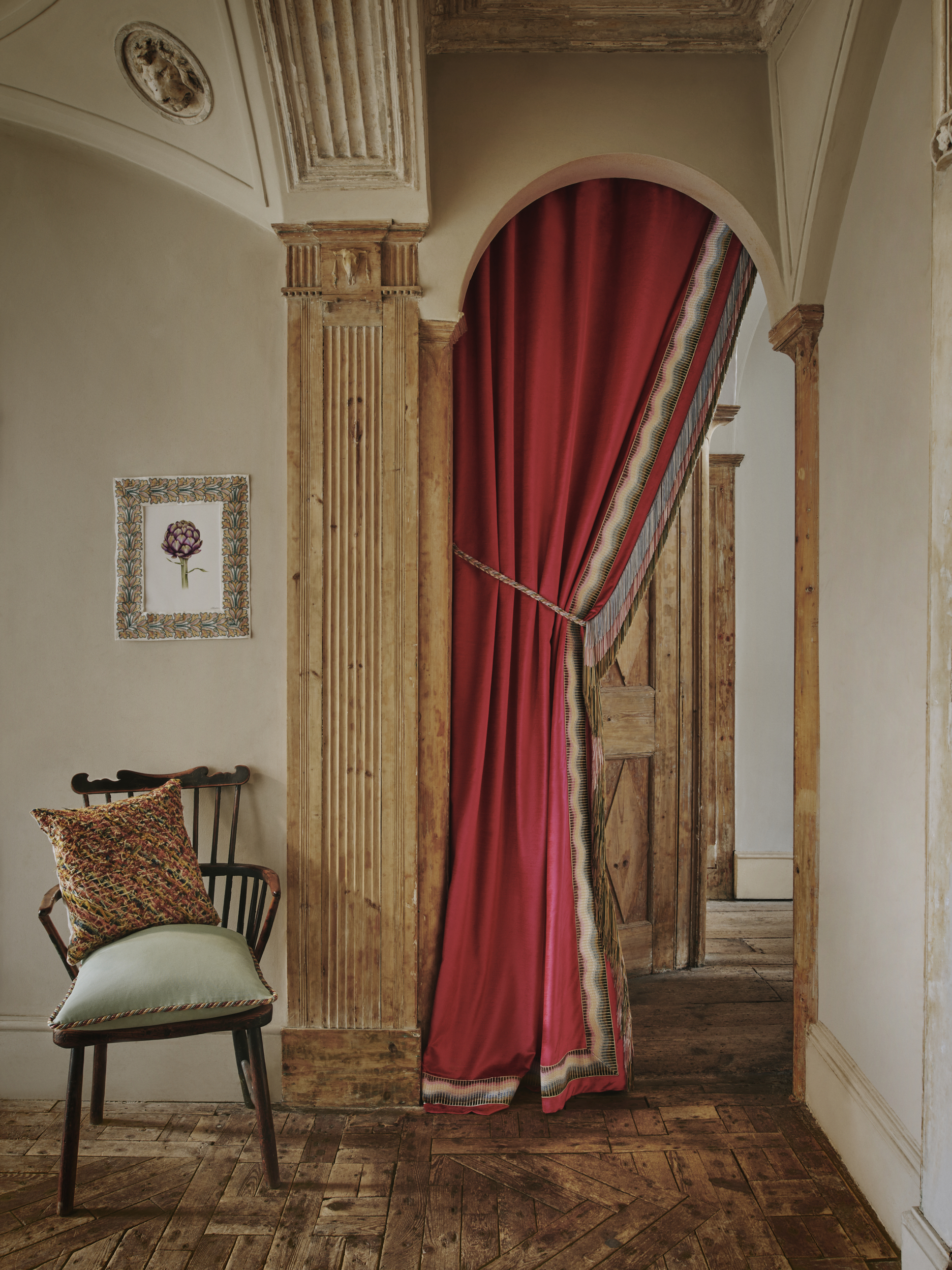
MG I’m most intrigued visually by Gloriette’s ‘Foglia Cablate’ embroidered border due the fluidity of its pattern and its unique construction. This border features a multi layered, hand printed ombre canvas ground that incorporates both translucent and opaque inks upon which scrolls of dimensional finely embroidered acanthus leaves cascade across its surface.
JLG What are some of the current trends in passementerie?
MG Today, wide embroidered or applique borders featuring geometric or botanical patterns are popular, as are various types of Tassel, Beaded or Onion Fringes down the leading edge of curtain panels.
JLG What period of design do you particularly like and why?
MG I’m probably a traditionalist at heart with a deep passion for documentary passementerie because of its elegance, time-honoured weaving/knotting techniques, sophistication and meticulous, beautiful handwork. However, it is with this understanding that I also love to challenge the bounds of classical patterning, proportions, fibers, constructions and colour in redefining what we consider ornamentation today.
JLG How has passementerie remained relevant in interiors?
MG Trimmings are the finishing touch, they represent a whole language of ornamentation that possess the ability to dramatically transform a scheme or application. Fringes can be made from novel materials and combinations such as glass, wood, hand covered beads, pom-poms or unusual shaped tassels. For Borders, it’s the ability to accentuate the lines of window treatments, introduce new patterns, textures and accent colours.
Samuel & Sons Passementerie is world-renowned for producing the finest quality trimmings, tassels, borders and braids. Established in the 1940s, Samuel & Sons began as a linen shop in New York City's garment district. In the following years the company evolved to focus solely on trimmings and interior design, and before long, customers were flocking from far and wide including names you may recognise, such as Andy Warhol and Salvador Dali. Samuel & Sons now have boutiques and showrooms across America, London and in Paris.
Marisa Gutmacher joined Samuel and Sons in 2010 as Vice President of Design for Samuel & Sons and is recognised as one of the industry’s foremost trimmings designers. Her extraordinary ability to successfully translate traditional aesthetics, materials and constructions into a contemporary context is widely renowned.
JO LEGLEUD Why did you want to collaborate with Maddux Creative?
MARISA GUTMACHER Samuel & Sons believes that exceptional design inspires, elevates and enhances the quality of people’s lives. We provide designers with endless creative possibilities, leading the world of passementerie with a visionary approach to classical trimmings in the 21st century. We collaborate with industry luminaries who bring a unique perspective to the art form within which we create. We sought to collaborate with Maddux Creative because of the lens with which they synthesize art, travel, architecture, fashion, history and craft into their interiors, which challenge convention, spark inspiration and a colour sensibility that delights the senses.
“Collaborating with Jo and Scott has been a marvelous creative journey in which we explored the language of neoclassical architecture and nuances of material combinations within the context of passementerie”. – Marisa Gutmacher, VP of Design, Samuel & Sons
Why did you want to collaborate with Samuel & Sons?
JLG Samuel and sons create passementerie that we have used across many projects, they seem to always have the right solution, contemporary but with a respect to the craft. I have enjoyed their custom and semi custom capabilities and became friends with Marisa, and a conversation grew from there.
What does 'passementerie' mean?
MG Passementerie refers to trimmings and is the art of making elaborate trimmings or edgings (in French, passements) of applied braid, gold or silver cord, embroidery, coloured silk, or beads for clothing or furnishings. Styles of passementerie include the tassel, fringes (applied, as opposed to integral), ornamental cords, galloons, pompons, rosettes, and gimps, as well as other forms. Tassels, pompons, and rosettes are point ornaments, and the others are linear ornaments.
JLG What kind of look does it create?
MG As with the variety of aesthetics that can be achieved with use of different textiles, applications and colour stories, trimmings can contribute to classical, transitional, eclectic and modern interiors. From festoons of traditional ornate hand tied silk tassels down a curtain panel, to a single contemporary graphic border edging the bottom of a sofa skirt or a micro woven cord delineating the silhouette of an upholstered chair -- tonal or multi, textural or highly refined, subtle or bold -- trimmings have continued to evolve over time. Today, there are endless choices in pattern, fiber, style, and colour to consider.
JLG Why might you want to use passementerie?
MG Similar to other home furnishings that are part of a designer’s language of ornamentation, trimmings are a means to communicate a designer’s vision. Its purpose is more ornamental and less functional, with the exception of curtain tiebacks or gimps to cover upholstery seams/tacks. Sophistication is achieved through attention to the finest details. Be it on a curtain, pillow, lampshade or upholstery furniture, Trimmings have the ability to introduce a new pattern, texture or colour into a scheme. It can create a focal point in the room due to its pattern or colour as well as change the edge condition of the piece on which it’s applied.
JLG How does passementerie work in more contemporary interiors?
MG Using traditional passementerie in contemporary interiors is all about attention to detail and curating a story based on pairing very specific elements to create the unexpected.
JLG What do you need to take into consideration when creating a collection like this?
MG The design process is never linear; it starts with a concept based on form, function and materiality. The source of inspiration for trimmings can begin with a particular fiber or construction, pattern, historical reference, or something in apparel, art, nature, architecture, a lifestyle or a trend. Where I begin evolves into something else through adjustments to pattern, construction, scale and colour placement. Collaborating with remarkable weavers and craftsmen around the globe, and with a deep understanding of the language of classical Passementerie, I’m constantly transforming what “was” into what’s relevant for the 21st century.
MG Talk us through the inspiration behind the collection.
JLG We (Scott and I) had always been interested in the idea of creating passementerie that could be like (replace) an architectural detail. It feels quite unexpected but also makes something versatile. I looked at neoclassical architecture, the acanthus, columns, arches etc., and took time to consider various ways of recreating them in passementerie. The palette of neutrals for this part of the collection seemed correct but I wanted to add more colour, so looking at Palladio as he created some beautiful follies (‘gloriette’ in italian) in the grounds of some of his projects, with frescoes and mosaics in beautiful colours, reflecting the seasons or landscapes. Richly coloured oil paintings, provides the starting point for the 4 colourways for the elementi groups, the designs of which were based on watercolours and collages I created in my studio.
MG What kind of look does the collection create?
JLG I love how the arches, dots and columns of the ‘Archi, Colonna and Punto’ series, with the painterly trompe l’oiel detailing, draw the viewer in to further understand what they are seeing. The lush chainette fringe of the ‘Elementi’ series is just so vibrant, glamorous and tactile.
MG Obviously you like all of the designs, but is there one that’s a particular favourite?
JLG I LOVE the ‘Foglia Cablate’... it’s subtle but detailed, and the colours are gorgeous. What about you?
MG I’m most intrigued visually by Gloriette’s ‘Foglia Cablate’ embroidered border due the fluidity of its pattern and its unique construction. This border features a multi layered, hand printed ombre canvas ground that incorporates both translucent and opaque inks upon which scrolls of dimensional finely embroidered acanthus leaves cascade across its surface.
Creative Confessions: Five minutes with Hector Coombs
Shame Studios founder Hector Coombs shares with us why rug design is special to him, the story behind the company, and the pieces that have inspired and influenced him.
Creative Confessions: Five minutes with Claire German
Claire German, CEO of the Design Centre at Chelsea Harbour, talks all things WOW!House, up-and-coming designers at the Design Centre, and her favourite current trends.
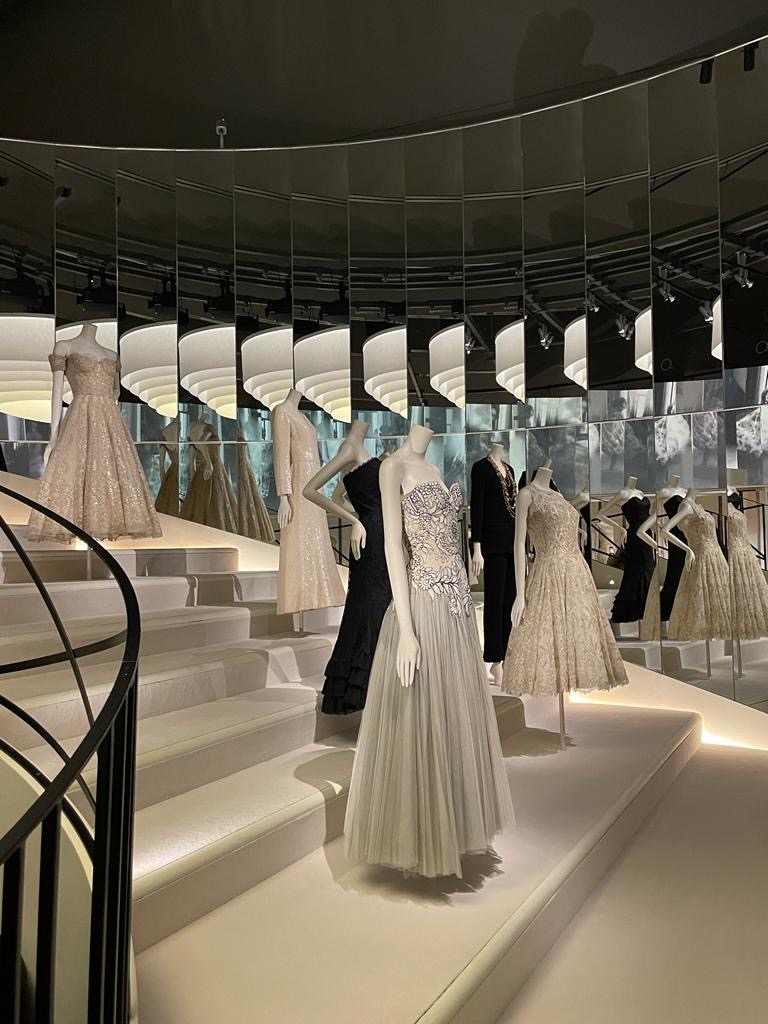
Chanel Exhibition: A Captivating Showcase
We visited the V&A's exhibition, a reinterpretation of the Palais Galliera showcase in Paris in 2020, which unravels the story of Gabrielle Chanel in a display both dazzling and brutally honest. Commencing and concluding with elements of utmost simplicity, the exhibit encapsulates the evolution of the iconic designer through the ages.