Primrose Hill Family House
We have always been committed to creating interiors which have longevity, and this is best illustrated in our most recent project, a Grade II five-bedroom listed house in Primrose Hill - where we got to work once again with previous clients. We were tasked with reusing furniture from their smaller property however, we were at pains to ensure that whilst reusing the furniture we didn’t want to make it feel like the same interior transplanted into a different, albeit a bigger building.
What quickly became apparent and evolved was the scheme thrived on contrast – masculine touches were set against feminine curvaceous furnishings, and we were able to create friction throughout whilst highlighting the individuality and integrity of each of the pieces in it.
We thought a lot about the floor plans, about how our clients would move through their home in different ways, and we wanted to ensure that the spaces wouldn’t sit empty or unused. It quickly became apparent when designing the space that we wanted to work with contrast to create different moods in different rooms.
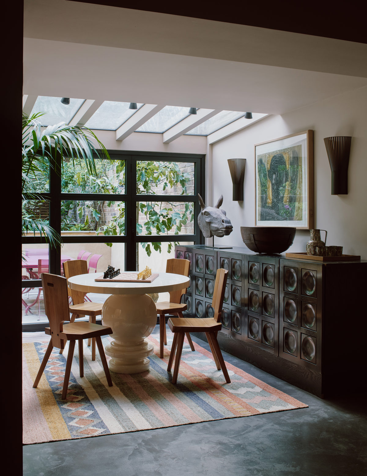
The new house retained plenty of its period detailing and needed little restructuring: it remains essentially two-rooms deep with a side staircase. We designed a new lower ground floor extension, with access to the garden, allowed space for a television and games room.
Throughout the scheme, there are many examples of repurposing like this, where pieces have been reupholstered to give a new accent, or fresh combinations were created. While this steered many of the design decisions, it is not the defining characteristic – if anything, it is the emphasis placed on pattern and colour, and the interesting and unexpected use of textures which makes this interior so unique.
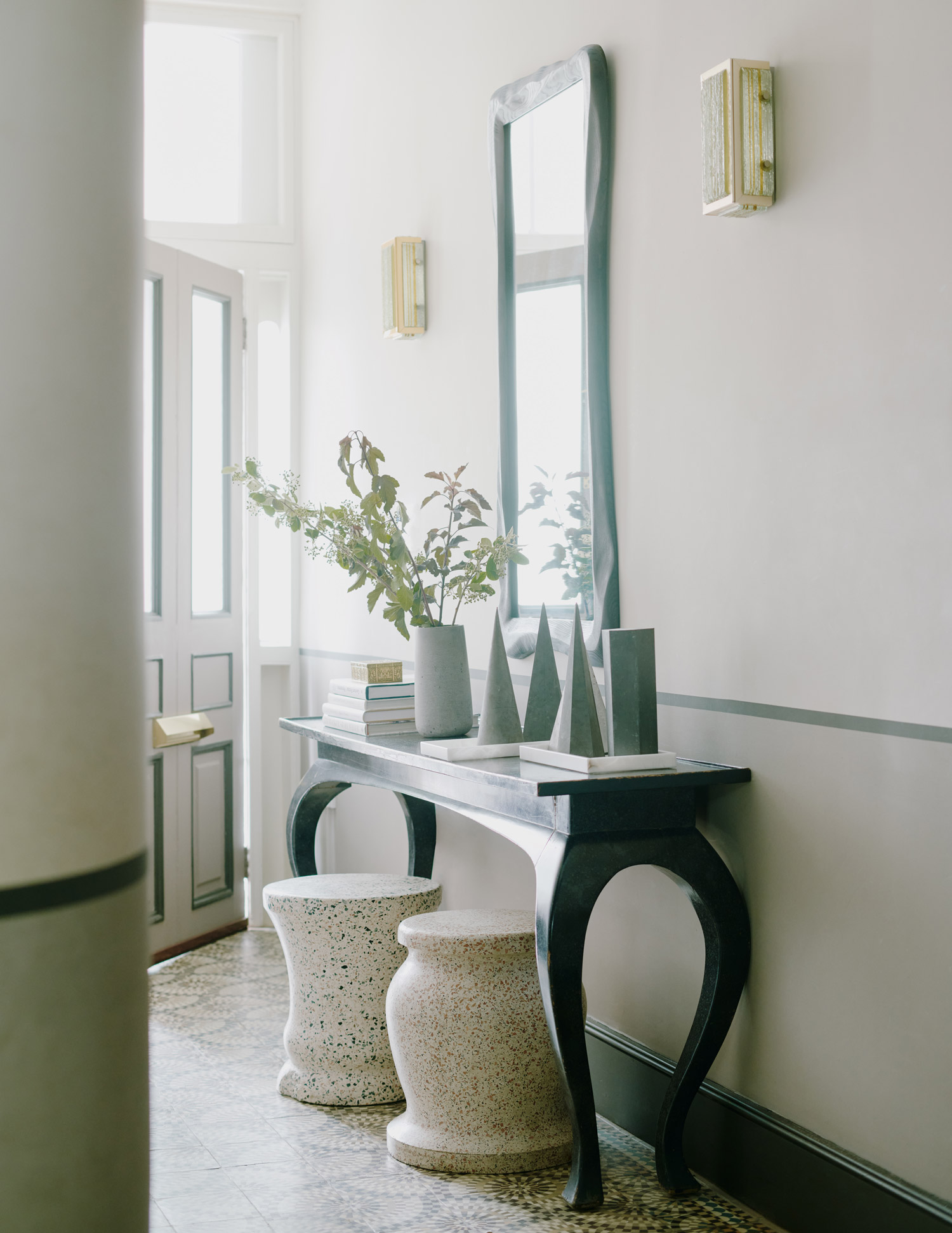
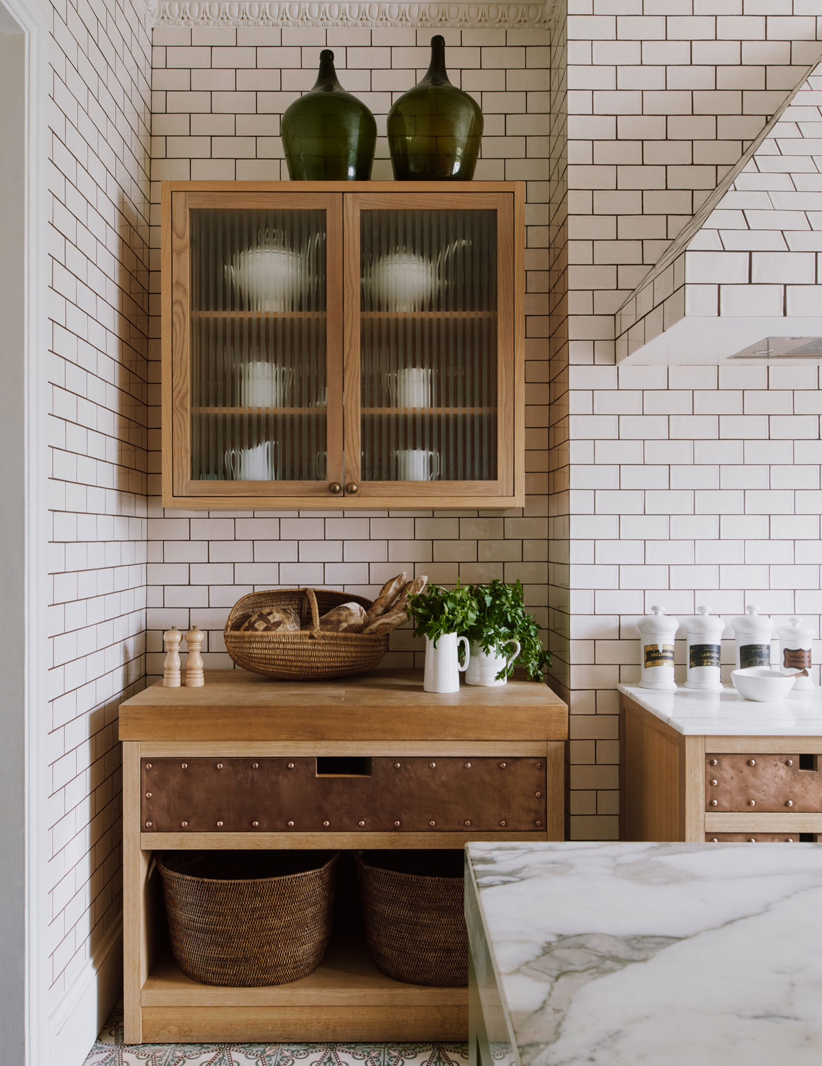
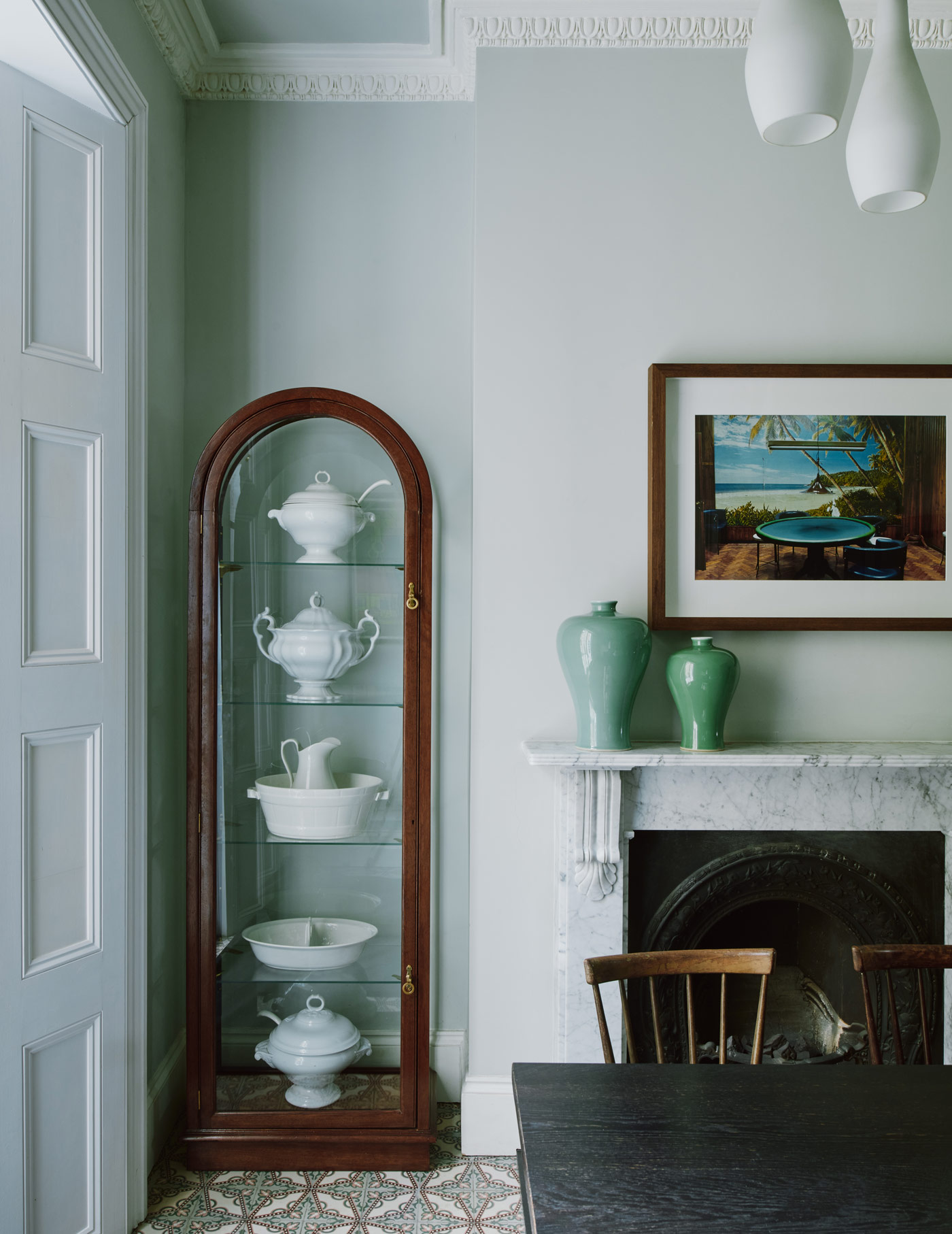
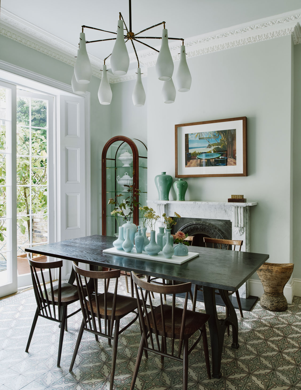
Throughout the entire ground floor, we created a floor design using different patterns of encaustic tiles sourced from a reclamation yard in the Netherlands. The thresholds between spaces and patterns required focus and thought: the result is relaxed and charming.
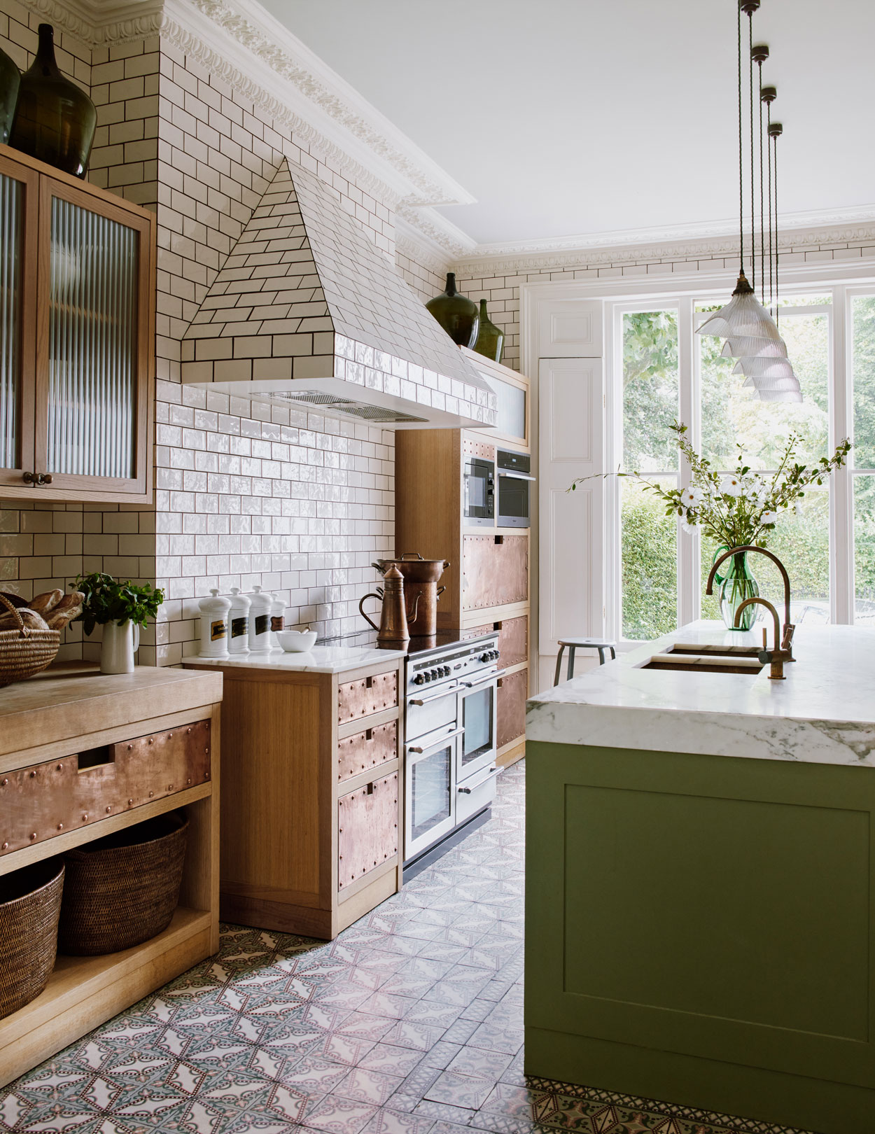
The hall and open plan kitchen and dining room are tiled in a busy colourful pattern and palette.
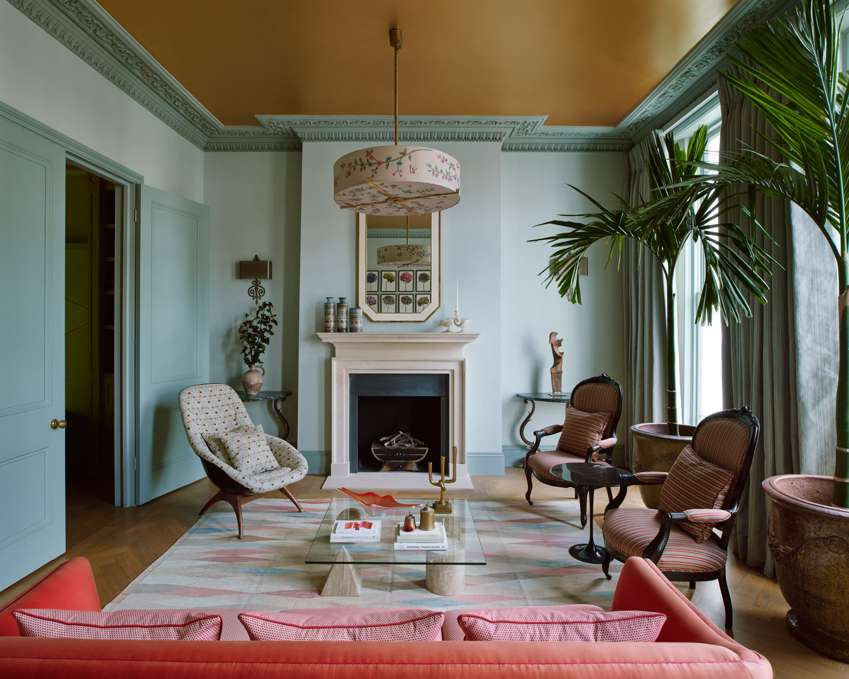
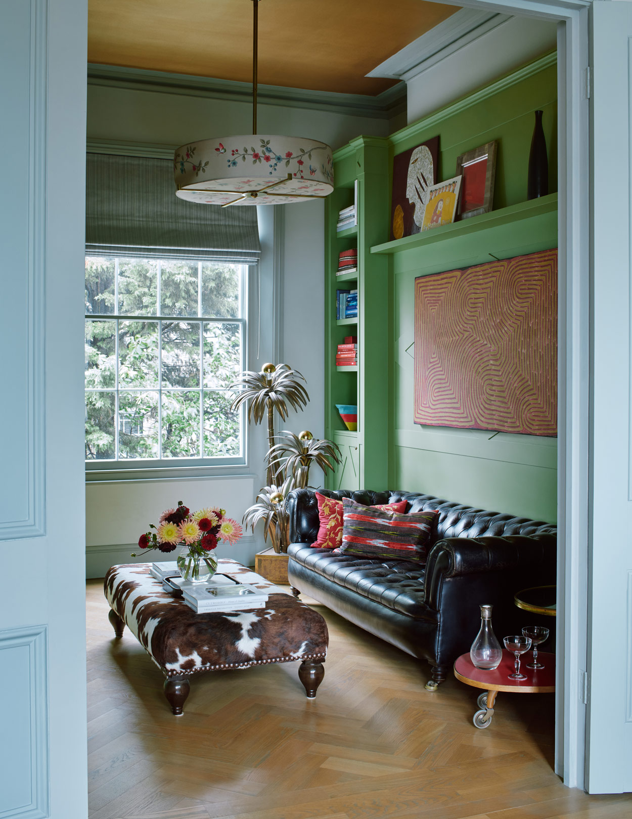
Warm metallic accents continue one floor up where the ceilings of the sitting room and adjoining library have been painted a coppery gold. We wanted to ensure the finishes were unexpected and restrained and we were able to add a touch of drama by adding a touch of varnish to the ceiling to give the impression of movement and sunniness.
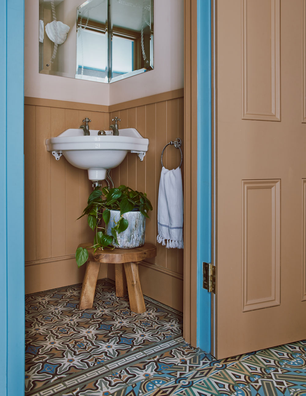
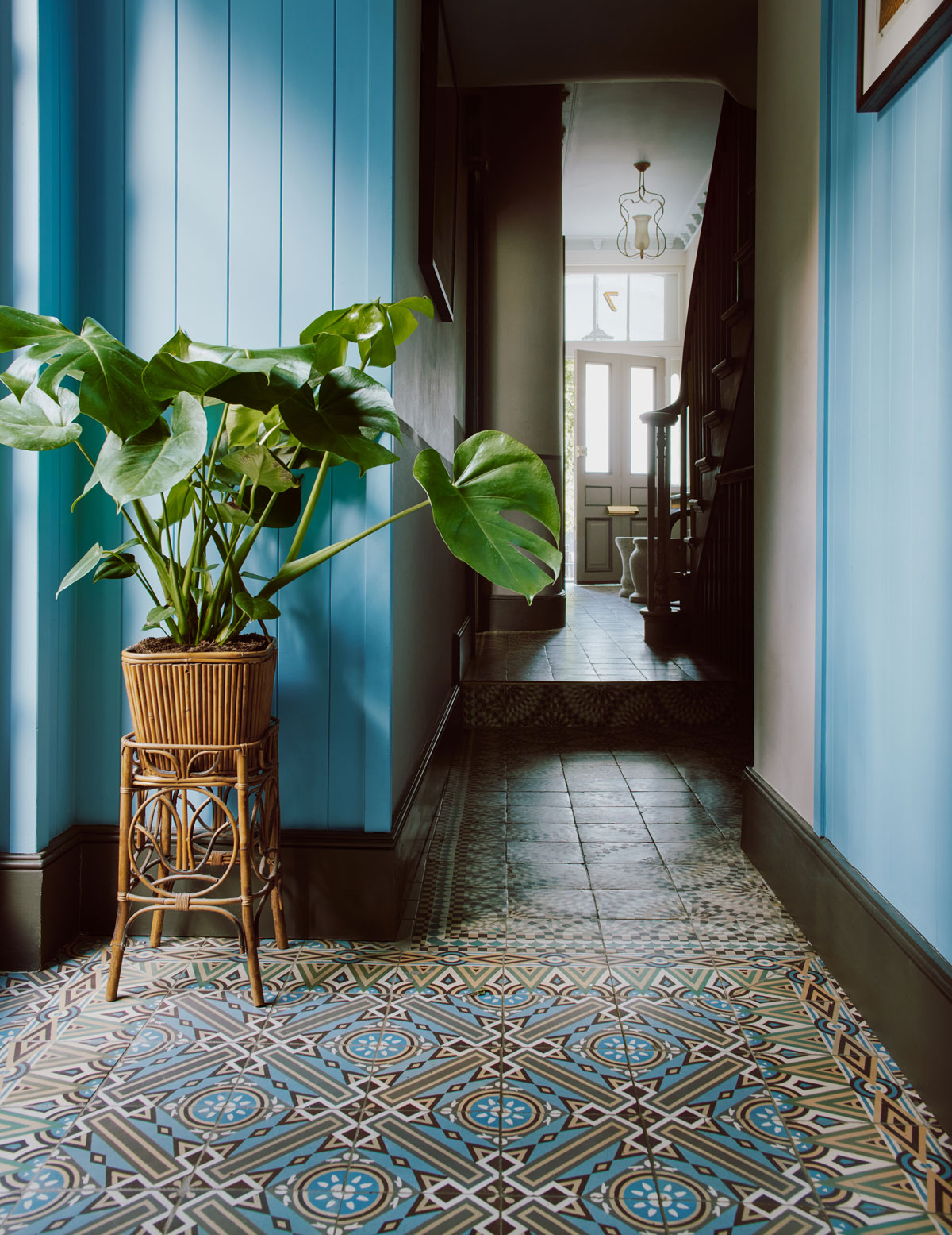
Colour pops with two different shades of blue (on the walls and woodwork) with a gold ceiling gives the scheme an uncontrived feel. We wanted a palette which was earthy and grounded, but with an enlivening mix of colour and pattern.
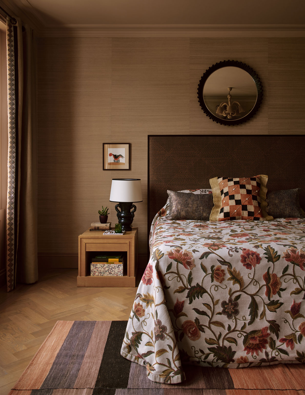
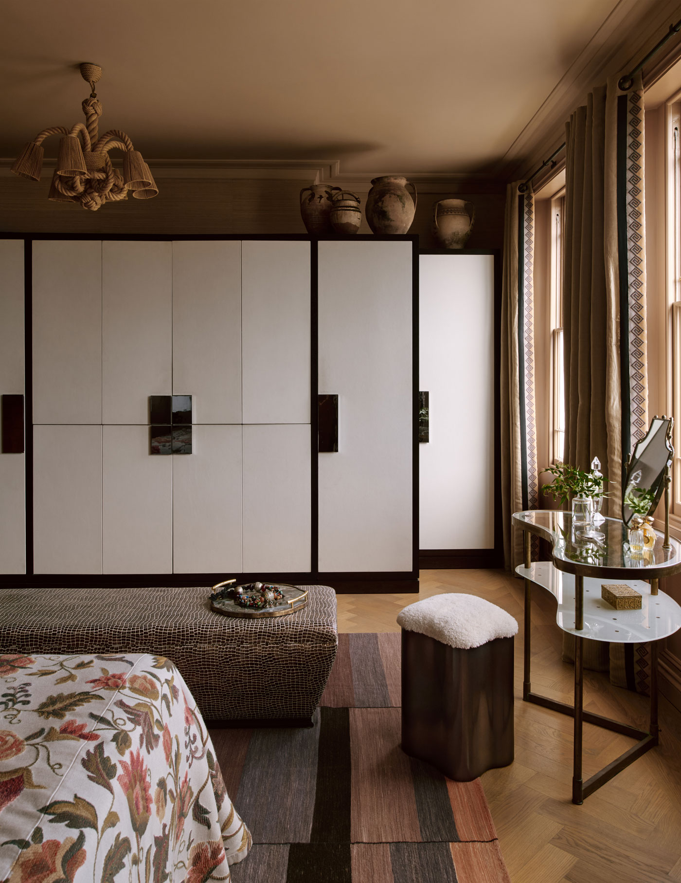
The second floor houses the main bedroom which has an earthy and rich tone which calms the space and features an Italian dressing table from Fiona McDonald has been paired with a ‘Lily’ stool from Tom Faulkner.
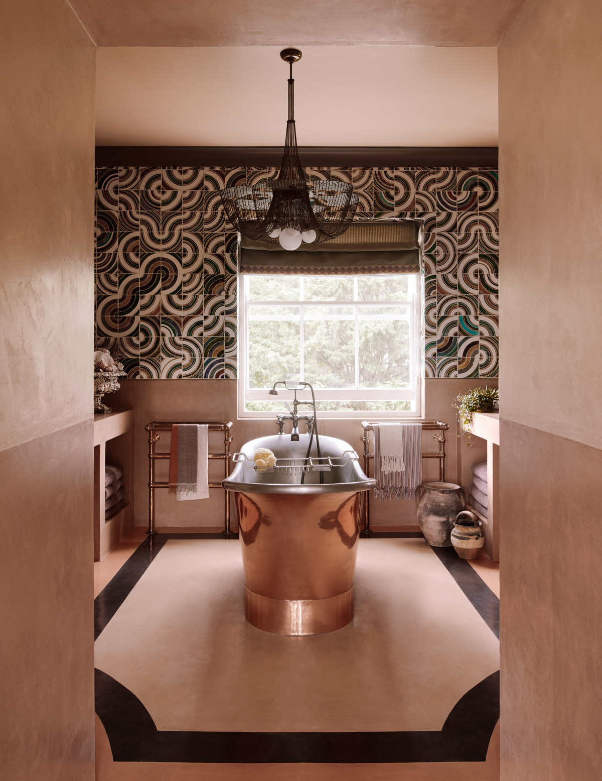
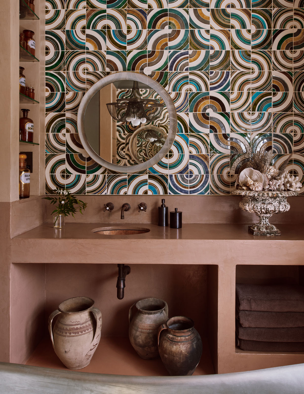
The en-suite bathroom has a free-standing copper bath framed by three different colours of tadelakt plaster on the walls, floor, and vanities. The upper portion of one wall is clad with swirling Portuguese tiles which extend into a chocolate brown painted cornice.
There is a harmonious balance to the house. It is elegant and playful, and we pushed the boundaries but not at the expense of it being liveable. We wanted to create a multi-layered, stimulating sensory experience for our clients. We explored materials, colour and form and juxtaposed these with contemporary and vintage finishes.
Photography – Michael Sinclair